
I don’t consider myself a designer by any stretch, but I wanted to have a place to document some of the choices I’ve made with regard to this website’s look and feel. Not sure how often I’ll update it, but I might add something every so often.
Inspiration
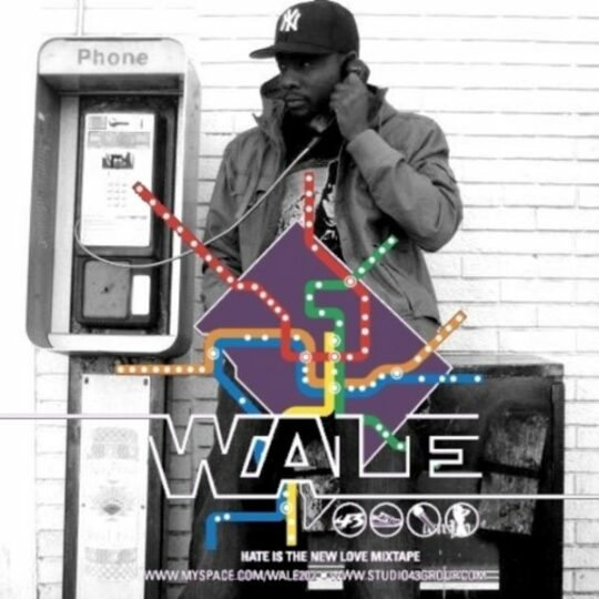
I’ve been a fan of the cover art for Wale’s Hate Is The New Love mixtape ever since the first time I saw it. The grayscale photograph in the background and the colors of DC’s Metro map overlaid in the foreground play against each other nicely. I’ve wanted to emulate something like this in a website’s design for a long time.
Colors
Instead of going with the same colors from the mixtape, I decided to look a little closer to home. Since I’m not from DC, I think I pulled my colors from an NYC subway map I found somewhere on the web, though it’s been so long I hardly remember. They’re a bit brighter, which I like, and I got the names from some online color name matcher. It’s kind of fitting that two of the names wound up being locations in Pokémon’s Kanto region.
Cinnabar
#ef3e42
Ecstasy
#f58220
Candlelight
#ffd420
Green Haze
#029d57
Deep Cerulean
#006bb6
Plum
#9d3d96
For the gray scale, I chose a pretty basic range. I think I found it as part of the default palette in a design program I was using at the time.
Mineshaft
#333333
Emperor
#4f4f4f
Gray
#828282
Silver
#bdbdbd
Alto
#e0e0e0
Concrete
#f2f2f2
Fonts
As a developer, I have been using Input Mono in my text editors and terminals for years. When I saw that DJR released its companion, Output Sans, I knew I had to use it for my next website. Nearly all the text across this website is set in Output Sans with few exceptions.
Output Sans
The world is veiled in darkness. The wind stops, the sea is wild, and the earth begins to rot. The people wait, their only hope, a prophecy…
“When the world is in darkness Four Warriors will come…”
After a long journey, four young warriors arrive, each holding an ORB.
For embedded code samples, the font switches over to the aforementioned Input Mono. It is also used on specific elements that are meant to look like video game text.
Input Mono
The world is veiled in darkness. The wind stops, the sea is wild, and the earth begins to rot. The people wait, their only hope, a prophecy…
“When the world is in darkness Four Warriors will come…”
After a long journey, four young warriors arrive, each holding an ORB.
Icons
Years ago, I bought all four Pictos icon packs from Drew Wilson, which I guess are now considered Pictos Classic. I still find myself using them in projects from time to time and this website is no different.
Software
Due to its simple aesthetic, most of this site was designed in code, right in the browser. But I will jump into Figma here and there to work through an idea or concept.
If there is anything else you want to know about, feel free to get in touch with me. I’m happy to answer any reasonable questions.
More interested in bytes than pixels? I have a page about the technology too.